Around the World: Australians Dislike Coin Design
A new Australian tribute coin honoring Queen Elizabeth II is generating fierce public debate, proving that even royal commemoratives are not immune to modern design controversy.
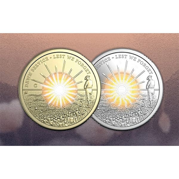
A recently released Australian coin commemorating the centenary of the late Queen Elizabeth II, featuring a portrait, is drawing criticism from just about everywhere.
The Royal Australian Mint (RAM) defended its new $5 and 50¢ coins, stating: “Our coin images don’t always capture the full beauty of a design once it’s etched in metal.”
According to a critical public, that may be an understatement. Comments posted to the RAM’s Facebook account included: “They should use her postmortem as a reference,” “She looks like she’s having you for dinner…literally,” “Uncle Charlie from My Three Sons with a wig and pearls,” and “What on earth were they thinking of? Did Charlie [a reference to King Charles III] actually give permission for this monstrosity?”
The depictions of the queen have been compared to some television characters, including the fictional housekeeper and cross-dresser Mrs. Doubtfire made famous by the late actor Robin Williams, and to the cartoon character Shrek, an unpleasantly green-colored, gruff ogre.
Australian media haven’t been 100% against the queen’s image on the coins, reporting such comments as “awesome” and “beautiful.”
Regardless of whether the consensus is for or against the designs, the silver proofs are sold out. The RAM website indicates that 5,000 $5 and 30,000 50¢ coins were produced.
The obverse of each coin features a portrait of the queen that, according to the RAM website, is meant to be “symbolically reflecting the many facets of Queen Elizabeth II’s life and legacy.”
The queen died in 2022 at the age of 96. The coin features her in a front-facing pose rather than a profile portrait. Images of a horse, a corgi, roses, and a lily of the valley incorporated into the obverse design are references to art and theater to mark “her enduring support for culture.” Australia’s national floral emblem, the golden wattle, is part of the design, as is a stylized St Edward’s Crown and the Auxiliary Territorial Service emblem. The ATS emblem is meant to acknowledge the queen’s wartime service during World War II and her “lifelong sense of duty.” The profile image of King Charles on the reverse isn’t getting much press, but it doesn’t appear to be criticized.
Aleksandra Stokic designed the controversial portrait of the queen. Stokic has been a senior coin sculptor and coin designer at the RAM since 2011. She is better known for her designs for the Centenary of Canberra and Australian Mining coins.
Serbian-born Stokic was first inspired to consider designing coins when she saw her brother’s coin collection as a child. She received a diploma in packaging design from the School of Design in Belgrade, then completed a degree in applied sculpting at the University of Belgrade. Her postgraduate specialty was in coins and medals. She has also completed studies at the School of Medallic Arts in Rome.
She worked for the Istituto Poligrafico e Zecca dello Stato (Italian State Mint) for three years, during which she developed concepts and models for medals, jewelry, three-dimensional sculpture, stamp designs, and coin designs.
In a 2019 NumisMag interview, Stokic said, “The Italian Mint taught me the importance of a good design, how to produce models that will coin well and unquestionably it was one of the best places to get experience to start my career.”
Designing coins is a complicated business. As U.S. Mint medallic artist Phebe Hemphill recently commented, “There’s a great challenge in making something in relief like this. It’s kind of a weird, fascinating challenge to fit everything into that very, very low space we’re allowed to sculpt.”
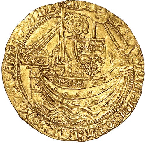
Coin designs used by the U.S. Mint have had their share of critics. The eagle appearing on the reverse of the first U.S. gold coins was criticized as being too scrawny, paving the way for the Heraldic Eagle design. Liberty on the obverse of our first large cents was said by the contemporary press to be “in a fright” due to her wild hair, while the Chain America reverse design sent the wrong message about the newly independent nation.
Hermon MacNeil’s Standing Liberty design for the 1916 quarter drew gasps from the general public since Liberty was portrayed with a breast being exposed. Coin designer John R. Sinnock’s Roosevelt dime and Franklin half dollar drew criticism from a paranoid American public, concerned about the Red Scare, which believed his “JRS” initials on the coins actually stood for Soviet dictator Josef Stalin.
You may also like: