Poll Question: What is your coin design hot take?
From the February 20, 2026, Numismatic News e-Newsletter, readers share favorites, along with critiques.
Recent designs are so often just simpleton drawings these days – best example: Mayflower on the quarter – clearly done in a time bind with no thoughts of the bigger symbology or larger message of the coin’s target’s mission. For goodness’ sake, the Mayflower design should have been a creative missive of their pursuit of (religious) freedom, their willingness to suffer to find it, and their mortal commitment to something better than their present lives, not to mention their faith throughout.
Instead, we got a picture of a boat put into metal. Any moderately ambitious or talented high schooler could have done as well. And so many of our coins in recent years have become the same: stifled creativity, settling for putting a drawing of the related person on the coin. It’s pathetic. And as a (the?) leading country in the world, yet another example of us losing our way, socially. So many other mints around the world are doing incredibly creative work, and while we settle for childish and incredibly boring designs.... or worse.
I spent 8 years on the CCAC and, in the process, learned the art of using symbols (not photographs), emotional appeal, design energy, and proper balance of images, empty space, and limited text. All of that has been lost to whatever process they use today. I don’t blame the artists – they are as talented as ever! - I fault the very process the Mint uses that chokes the artists with so incredibly constrained commission descriptions as to kill creative freedom and discovery from the get-go. It is very sad as they have dumbed down so many designs as to make them essentially meaningless and uncollectable for anyone that is more than a fill-the-slot-in-the-Whitman-folder collector. About all they have of quality are old, classic designs. And they are certainly draining collectors’ pockets and budgets, recycling them ad nauseam. Paul Hollis: Please save us from this slop.
Erik N. Jansen, Seattle, Wash.
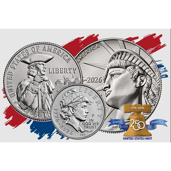
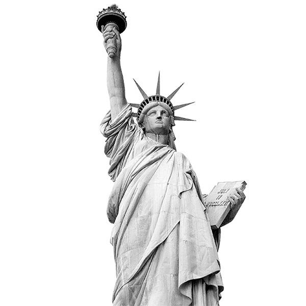
My hot take is the new 1776-2026 250th anniversary half dollar. The obverse of this coin seems to portray a modern theme while at the same time keeping our traditional theme of lady liberty all at the same time. It is a long, long overdue change from the old 1964 Kennedy half dollar.
Dave Burdis, Charleroi, Pa.
Though I haven't seen one yet, only a pic, I really like the new dime. To me, it looks like something from the past. I do like modern coins, but I really favor the coins of America's past, and I think the newly designed dime fits right in with the coins of our past.
Ed, Address withheld