Should I offer an opinion about art?
Art can be such a sitting duck, such a target for writers like me. When I saw the five America the Beautiful quarter designs on Page 1 my eye went quickly to the Mount Rushmore design. My first thoughts about it were sophomoric. Look at the nose. It might be described as Thomas Jefferson getting help from some little people to perhaps pick it.
Art can be such a sitting duck, such a target for writers like me. When I saw the five America the Beautiful quarter designs on Page 1 my eye went quickly to the Mount Rushmore design. My first thoughts about it were sophomoric. Look at the nose. It might be described as Thomas Jefferson getting help from some little people to perhaps pick it.
Is the design as bad as my initial reaction to it?
I can write truthfully that I am a fan of the 2005 nickel obverse that shows a partial profile of Jefferson. It is dramatically different than the one we were used to seeing from 1938 to 2004.
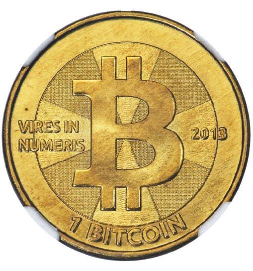
The 2005 nickel obverse design is similar to the 2013 quarter, but I think the one on the nickel works and the one coming on the 2013 quarter simply doesn’t. It might look better on the 5-ounce silver coin, but I have doubts even about that.
I hope that my reaction to the design doesn’t become the typical one because in order for American coins to have more artistic designs, we have to give artists the freedom to go where their talents tell them to go.
It is only natural for all collectors to look at a group of five designs and determine their favorite and their least favorite.
I like the Fort McHenry design in a close race with the Bristlecone pine.
I will not hold my taste up as being in the least bit sophisticated. I simply know what I like – and even that can change.
When the Connecticut state quarter was released in 1999 with the Charter Oak design, I thought it was ghastly. Why? Certainly I had the image of the 1935 Connecticut half dollar in my mind and the trees didn’t resemble each other in the slightest. But both designs are art. Why should they resemble each other?
Over the years as I have gotten used to the 1999 Connecticut quarter I have grown to rather like the design. It is clean and conveys an historically significant message. That is what it is supposed to do.
The state quarter design that I most like to pick on is from Wisconsin. It looks like a hodgepodge work designed by committee. By golly, it was designed by a committee, and to make matters worse it was then voted on by the public. Artistic designs fell by the wayside in the vote in favor of a cow’s head, a corn stalk and a wheel of cheese.
The Mount Rushmore quarter definitely is not a design from a committee. Perhaps like the Connecticut quarter it will grow on me and in a couple of years I will be able to knowledgeably report on my “artistic growth.”
After what I have written about the Charter Oak, is it any wonder I can say that I like the Bristlecone pine design?
The Perry-Peace Memorial design with the image of Perry and the column I am not fond of, either, so I guess that puts the White Mountain National Forest design right in the neutral position between the two designs I don’t much care for and the two I like.
My opinion is not the final word. Which ones do you like or dislike? Email me at david.harper@fwmedia.com.
More Coin Collecting Resources:
• Subscribe to our Coin Price Guide, buy Coin Books & Coin Folders and join the NumisMaster VIP Program