Atrocious designs?
You can’t please everybody, and if you’re a coin designer you’re sure to attract your share of critics. Today, James Earle Fraser’s Buffalo nickel is considered a classic, but at…
You can't please everybody, and if you're a coin designer you're sure to attract your share of critics. Today, James Earle Fraser's Buffalo nickel is considered a classic, but at the time of its release, in 1913, not everyone was on the Fraser bandwagon.
The New York Times, for instance, complained its March 2, 1913, issue that "The new 'nickel' is a striking example of what a coin intended for wide circulation as small change should not be."
The paper noted that the coins, which had been released the day before by the sub-treasury, were bringing 10 to 15 cents on the street, "but there will be no great eagerness to get them hereafter in preference to the old five-cent coins."
In fact, the New York Times preferred the Liberty Head nickel. With its large "V" and the word "Cents," it served its purpose well, the newspaper reported, as those unfamiliar with the coin could easily tell its denomination. Whereas, on the new nickel, the lettering was so small that "it can only be deciphered by strong eyes in a bright light."
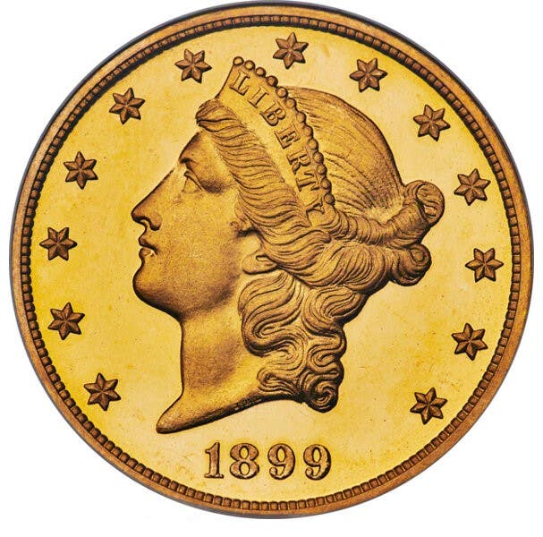
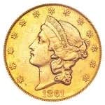
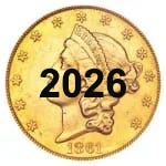
More amazingly, perhaps, was the paper's statement that until this new nickel arrived, the latest "atrocities" from the U.S. Mint were the new gold $5s, $10s and $20s, or the designs of Bela Lyon Pratt (gold $2.50 and $5) and Augustus Saint-Gaudens (gold $10 and $20), now highly thought of by collectors. "These are bad coins in design and execution," the New York Times related.
In its March 5th issue, the newspaper ran a letter from H.P. Nitsua of Connecticut, who also disliked the new nickel. "Numismatology can hardly be congratulated on the new recruit to its ranks," he proclaimed.