Poll Question: How do you define eye appeal in a coin, and what aspects matter most to you when evaluating it?
From the July 4, 2025, Numismatic News e-Newsletter, beauty is indeed, in the eye of the beholder.
A coin has the most eye appeal to me when it is fully struck and its surfaces are as close as possible to what it was like when it was first minted with the least amount of blemishes of any kind or toning.
Louis Ludiciani, Cumberland, R.I.
I look for sharpness in the features of the coin…Gently worn is okay.
KE, Germantown, Ohio
The date, followed by the mint mark. I like to think about who might have handled it, and what was going on in the world at the time.
Name and Address Withheld
I just usually look for coins that are basically clean, it doesn't need to be shiny, but in readable condition. Secondly, is pricing, then do I think it fits into my collection. Finally, is it priced fairly and finally of course is the final cost. But then if I really, really want it, it's going to be mine.
Roy E Robertson, Maryland
I am attracted to coins that are XF or better and look "original"—no "raw" or "lifeless" surface due to dipping, etc. Next, I find that if the coin began as a detailed strike, it retains an attractive deep relief look.
Larry Vann, Address withheld
That’s an interesting question, and it depends somewhat on the series and the metal content.
For instance, what has eye appeal in a gold double eagle is different from a silver walker. Silver is a reactive element, and especially if it’s exposed to sulfur, it can create beautiful works of art that you don’t see in gold.
And copper is another story.
But basically, I look for the following:
First, if it’s an uncirculated coin, I look for original luster, try to avoid coins that have been overdipped, and certainly try to avoid hairlines.
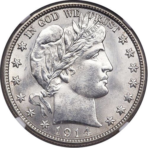
Secondly, I look for the strike. And in a series like buffalo nickels, which have notoriously weak strikes from the branch mints in the 1920s, I look to see if the horn is full and how much detail there is in the buffalo’s head and back, and if the date is fully struck. On walkers, especially the earlier dates, what do the skirt lines look like, and the back leg, which is often weakly struck.
Thirdly, is there toning. Is it original or AT? Does the toning enhance the overall beauty of the coin, or is it a bit ugly?
Many collectors will pay thousands over the grey sheet for nice toning. I won’t, but will pay 10-20 percent above grey if it’s attractive.
On Indian head cents, I generally look for nice R/B coins that are more red than brown and cost much less than full red designations.
Gold, I generally look for nice strikes with abundant luster.
In the last few years, I have been buying proof coins from the Seated, Barber, and Liberty Head nickel series. Many of these coins are extremely attractive, and I especially like proof cameos with great contrast, which can be magnificent coins.
But in the end, it comes down to one thing: beauty is in the eye of the beholder, and you, the collector, must decide what’s attractive to you and what isn’t.
Roy, Address withheld
Eye appeal likely means different things to different people. I've handled and seen numerous collections formed in the late 1950s and early '60s that contained mostly cleaned coins from Good to Uncirculated. Eye appeal must have been defined as shiny and/or untoned. Today, there are those who still define eye appeal as untoned.
For me, eye appeal is a combination of a decided lack of surface marks, good underlying luster, and a touch of light peripheral color. On the other hand, booming original luster without the color can be equally attractive.
At the end of the day, there is no one answer, other than for the purchaser to choose a coin or note that appeals to them. Learn to grade and buy the coin or note, NOT the holder.
Gary Burhop, Address withheld