Changing Nickel Designs
The United States has had 5c coins made with nickel since 1866. Well before that year and continuing for a few years after, coins with a 5c denomination were made…
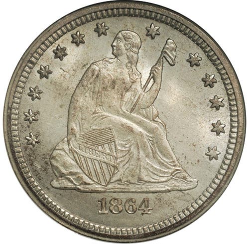
The United States has had 5c coins made with nickel since 1866. Well before that year and continuing for a few years after, coins with a 5c denomination were made primarily of silver. These were the half dimes, and the first “old” coin in my collection was a Seated Liberty half dime. I found it knotted inside a distant relative’s silk scarf.
What happened to this first coin in my collection is almost too painful to relate. For some reason, my mother carried it in her purse for safekeeping. Unfortunately, she put her purse atop the family car one day and then drove off, forgetting it was there. That day someone undoubtedly discovered my half dime when he/she opened the purse found by the side of the road in Houston, Texas.
Although I’m going to talk about the designs of nickels in this article, with the exception of War Nickels, the metallic composition of the coins has been 75 percent copper and 25 percent nickel. Should they be called 5c coppers rather than nickels? Or perhaps copper nickels? After all, the U.S. had copper-nickel cents from 1856-1864, and their nickel content was only 12 percent.
At any rate, when I think of all the designs of nickels, it occurs to me that the first three designs (Shield, Liberty Head, Buffalo) were all modified either during their first year of production or shortly thereafter. In other words, the designer’s first effort didn’t quite work as intended and had to be revised, sometimes not for the better.
Designed by James B. Longacre, of Indian cent renown, the Shield nickel had an obverse only a mother could love, to paraphrase an old saying. In his Complete Encyclopedia of U.S. and Colonial Coins, Walter Breen wrote, “The shield design was promptly ridiculed as ‘the ugliest of all known coins,’ while even Joseph Wharton called its obverse ‘A tombstone surmounted by a cross overhung by weeping willows.’” Wharton, the owner of a nickel mine and refining works, obviously had a vested interest in the use of nickel in coins.
With its shield on the obverse, the nickel’s design is similar to that on the 2c piece, which, not coincidentally, was also designed by Longacre. The reverse has a ring of stars enclosing a large 5, with rays separating the stars on all 1866-dated nickels. The rays made striking the coins more difficult, and they were removed from the design after a relatively small number of coins with rays had been struck in 1867. The remainder of nickels that year and all subsequent years have stars without rays between them.
The last year for Shield nickels was 1883, which is the first year for the next nickel design type, the Liberty Head nickel, minted between 1883 and 1913. Charles E. Barber’s conception has a Liberty Head facing left on the obverse. The reverse design features a wreath of corn, wheat, and cotton surrounding a large letter V, the Roman numeral for 5. These coins were known colloquially as V-nickels.
One thing the new nickels didn’t have in part of 1883 was the word CENTS, which was located below the ring of stars on Shield nickels. As a result of this “mistake,” some of the new nickels were gold plated and passed as $5 gold pieces. This practice was soon quashed with the addition of the word CENTS beneath the bottom of the wreath.
Although the Liberty Head design was supposed to be terminated in 1912, five of the design were minted surreptitiously in 1913. Despite their sub rosa origin, the 1913 V-nickels have often been the goal of wealthy numismatists, and the presence of one in an auction typically results in bids in the millions.
The third major nickel design was minted from 1913 through 1938. Designed by James Earle Fraser, this was the Buffalo nickel, which is called that because of the large buffalo on the reverse. Although Fraser’s coin might have been called an Indian Head nickel, this designation apparently never caught on. With its realistic portrayal of a Native American on the obverse, the Buffalo nickel is considered one of the U.S.’s most attractive coins.
The initial design of the coin in 1913 featured the buffalo standing on a mound, below which are the words FIVE CENTS. Because of the problem with the first version of the V-nickel lacking the word CENTS, it was feared that the placement of the denomination on this new nickel would cause it to wear away quickly. This irrational fear of another CENTS-less nickel led to another design change. On the new version, the buffalo no longer stands atop a mound. The mound has been reduced to a plain, with the denomination placed in a recessed cavity below the plain. There, it did not wear away quickly.
Unfortunately, a similar change was not made to protect the date. The result is that many Buffalo nickels still circulating by the 1960s were dateless. Although it’s possible to treat the date area with acid, such restored-date coins have very low value compared to coins with dates.
As beloved as the Buffalo nickel is today, by the end of its 25-year reign, the Mint was ready to get rid of it because of minting difficulties. The intricacies of its design and the hardness of nickel made the coin difficult to strike up completely. As an extreme illustration of this difficulty, I was once shown a roll of uncirculated 1926-D nickels, a date that’s well known for its poor-quality strikes. Although the coins had full mint luster, the amount of horn on the buffalo would have earned them a grade no better than VG. As David Lange put it in The Complete Guide to Buffalo Nickels, “. . . the majority are so poorly struck as to render them undesirable to collectors.”
In 1938, a design competition was held to replace the nickel’s Indian Head obverse and buffalo reverse with Thomas Jefferson and his house (Monticello), respectively. With an April 15 deadline for submission of entries, few had been received by mid-March, which appeared to indicate a lack of interest by artists. As a psychologist, my guess is that what it really meant was that talented artists tend to procrastinate because of their personality types. Whatever the case, the competition judges examined 390 entries on April 20 and selected those by German-born Felix Schlag to receive the $1,000 prize.
Before the design was minted, Schlag was forced to replace his artistic, three-quarters view of Monticello with a plain, head-on view. This change was described by art historian Cornelius Vermeule as follows: “Official taste eliminated this interesting, even exciting, view, and substituted the mausoleum of Roman profile and blurred forms that masquerades as the building on the finished coin.” For some unknown reason, Schlag didn’t include his initials in the coin’s design, and these weren’t added until 1966.
Although it didn’t lead to a major design change, the composition of the nickel was changed in 1942 to an alloy of 56 percent copper, 35 percent silver, and 9 percent manganese. The reason for the change near the beginning of American involvement in World War II was to conserve nickel, a critical war material for “. . . automobiles, aircraft, electrical, energy, and naval equipment.” To facilitate the removal of these nickels from circulation, the mintmark was enlarged and moved from its inconspicuous position to the right of Monticello to a location above the building’s dome. Philadelphia-minted war nickels received a large P rather than no mintmark found on earlier and some later Jefferson nickels.
Another thing that made war nickels easy to find was that they turned an ugly gray color after some time in circulation. When I was a kid looking through sacks of nickels in the late ‘50s, early ‘60s, I could spot the war nickels and put them into the discard pile immediately because of their color. They had not yet acquired significant value for their silver content.
By contrast to the way war nickels looked after extensive circulation, I’ve always thought that mint state or slightly circulated specimens are the best-looking Jefferson nickels of all. Credit their silver content for their mint state beauty.
I tested my idea about their beauty on a non-collector, presenting her with a mint state war nickel and a mint state Jefferson that wasn’t a war nickel, an MS65 1950-D. My wife chose the war nickel as the winner.
Design changes were made in 2004 and 2005 for the bicentennial of the Louisiana Purchase and the Meriwether Lewis and William Clark journey to explore the newly acquired territory. On the 2004 nickels, the obverse design stayed the same, but the reverses changed. One new reverse featured an adaptation by sculptor-engraver Norman Nemeth of an Indian Peace Medal designed for President Jefferson. The Peace Medals had a portrait of Jefferson on the obverse and symbols of peace and friendship on the reverse. These symbols were a peace pipe crossed with a tomahawk above a pair of clasped hands.
With a design by Mint sculptor-engraver Alfred Maletsky, the second 2004 reverse showed a keelboat of the type used by Lewis and Clark to navigate waterways at the beginning of their journey. The boat could be rowed, poled like a raft, or sailed depending on conditions on the body of water. It could also be towed from the riverbank. Captain Lewis had detailed its ingenious design.
The 2005 nickels featured new designs on both obverse and reverse. Facing right, a new obverse image of Jefferson by Joe Fitzgerald was based on a 1789 bust of Jefferson by Jean-Antoine Houdon. In Fitzgerald’s depiction, Jefferson faces right.
During the first half of the year, the reverse design was of an American bison. This image was the work of Jamie Franki, an associate professor in the Department of Art and Art History at the University of North Carolina Charlotte. Franki’s robust portrayal of a bison was viewed quite favorably by coin collectors.
During the second half of the year, the reverse lost its bison image and gained what is called the “Ocean in View” reverse, which shows a coastline with the words “Ocean in view! O! “The Joy!” The quote was taken from Clark’s journal, with a correction of Clark’s “ocian.” This design was the work of Joe Fitzgerald and Mint sculptor Donna Weaver.
One final design change for the Jefferson nickel occurred in 2006, when the reverse design reverted to the reverse from 1938-2003. The obverse changed, however, to a new image of Jefferson by Jamie Franki, sculpted by Donna Weaver. Franki’s bust of Jefferson was based on the work of Rembrandt Peale in 1800. Jefferson faces forward in this new image and the word “Liberty” in Jefferson’s handwriting appears in the field next to his chin.
As you can see, there have been quite a few design changes for the nickel in the 157 years since the 1866 Shield nickels were introduced. If you’re keeping track, there were two different Shield nickels, one with rays between the stars and one without the rays; two different Liberty Head (or V) nickels, one without CENTS and one with CENTS; and two different Buffalo nickels, one with the buffalo on a mound and one with the buffalo on a plain. As for Jefferson nickels, there was the initial design by Felix Schlag, which was modified during the war years (1942-1945) through a change in the metal composition and by the movement and enlargement of the mintmark, including the P mintmark for Philadelphia Mint products. Another set of changes came in 2004-2005, with four new designs, two modifying only the reverse in 2004 and two changing both the obverse and the reverse in 2005. Another change came in 2006, with a new version of Jefferson on the obverse.
Will the current design of the Jefferson nickel be the final design of the series? Only time will tell.

